Our Range
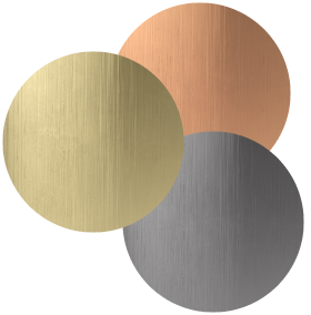


COLOUR PSYCHOLOGY IN THE KITCHEN: THE IMPACT OF YOUR KITCHEN’S COLOURS
Colour is a powerful nonverbal communication tool and is used to generate emotional and even physiological responses. The study of what those responses might be is called colour psychology.
How we gravitate towards the colours we like has a strong environmental influence from childhood and culture, but colours themselves contain their own purposes.
As the kitchen is the core and communal hub of the home, applying colour psychology to this area can set the tone for the rest of your spaces. It’s essential to think about your kitchen’s functionality, but how you colour it can give a distinct personality that works cyclically to provide you with specific emotions too.
There is no one ideal colour for kitchens; it’s entirely at your discretion. But if you are interested in learning about how colours can evoke an internal response, keep reading our guide into colour psychology in the kitchen.
PINK
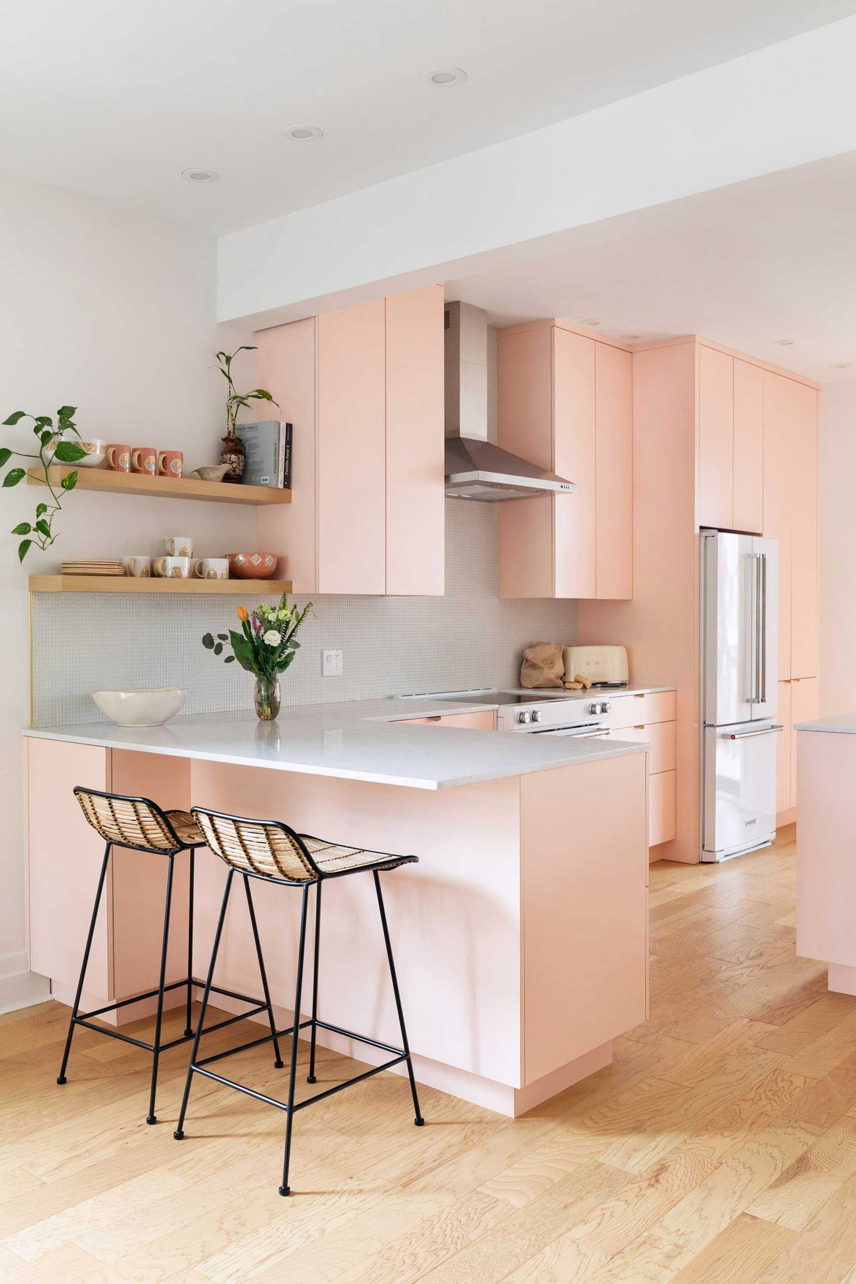
Starting off our analysation of colour psychology in the kitchen, we have pink. Pink is known for its sweet and uplifting sensibilities, encompassing emotions of calm, love, compassion, and kindness. It’s a tone that is profoundly affected by individual and cultural influences, making it quite a polarising preference. Interestingly, a particular shade called Baker-Miller Pink or ‘Drunk-Tank Pink’ has been observed to help reduce aggressive and hostile behaviour. Thirty jails in Switzerland are this colour in an effort to calm down disruptive inmates, while in the past, the University of Iowa’s visiting locker room was pink to try and subdue their opponent’s strength.
Pink could be an ideal colour for kitchens when wanting to create a calming and nurturing space. Pink traditionally associates with femininity, but as we’ve progressed, it is commonly used in interior design regardless of gender. And in the 18th to early 19th-century, pink was considered to be very masculine! It’s really just up to personal taste. If you want to incorporate a lot of pink in your kitchen, try painting your cabinets. Smaller amounts of pink can be implemented through fixtures, hand towels and decor.
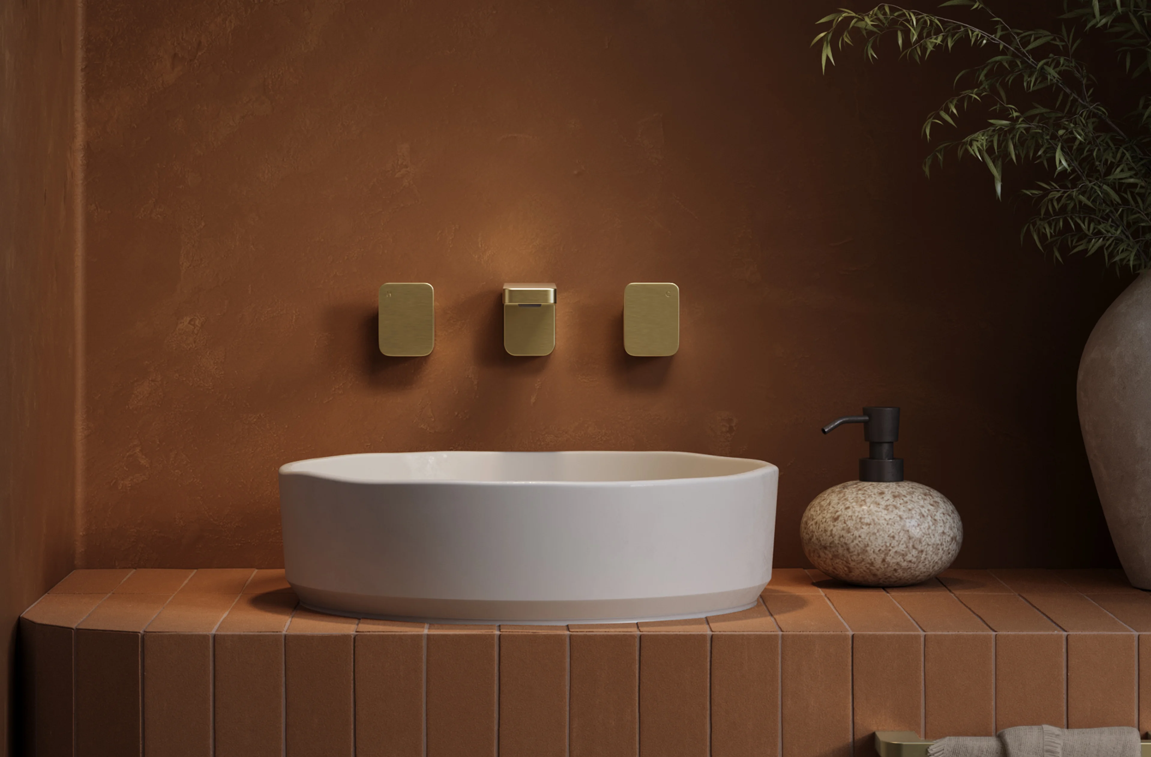
ORANGE
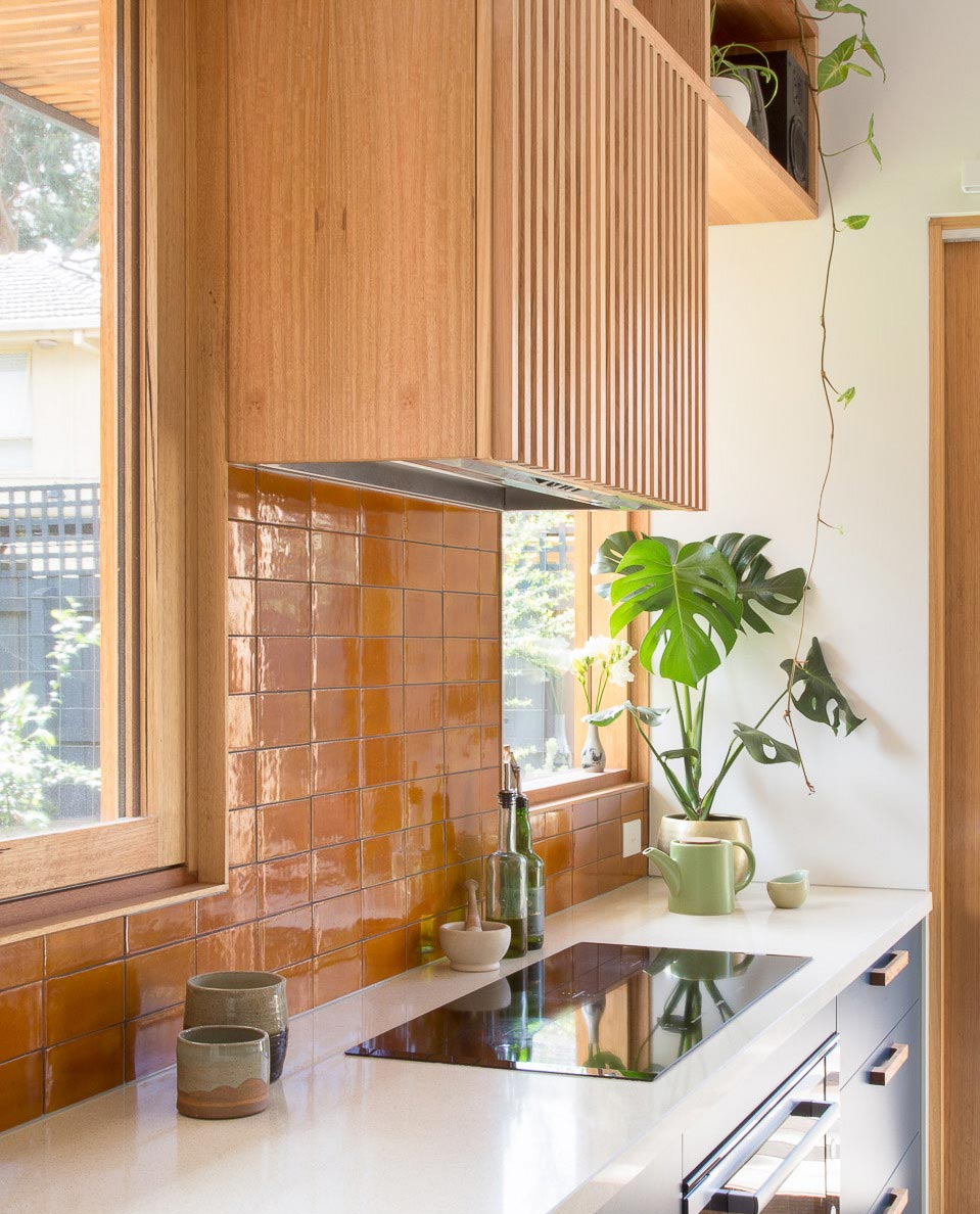
Orange in colour psychology pertains to dynamic, passionate and enthusiastic emotions. It mixes the driven energy of red and the joyful feeling of yellow to produce an adventurous, extroverted personality. Because of orange’s energetic qualities, it is common to find it on sporting jerseys and brands such as Fanta, Mastercard and Amazon.
If you like lively colours or environments, orange could be the choice for your kitchen. It’s terrific for encouraging vitality and very fitting for homes that enjoy hosting. As orange is profound and rich, it could be a conceptual approach to cultivating warmth if you live in a cold climate or honour your region’s hot weather. A great way to implement orange into the kitchen is through backsplash tiles. If that’s too intense, try incorporating materials like terracotta or warm timber cabinetry.
ABI products for orange kitchen colours: Elysian Kitchen Mixer and the brushed copper range.
YELLOW
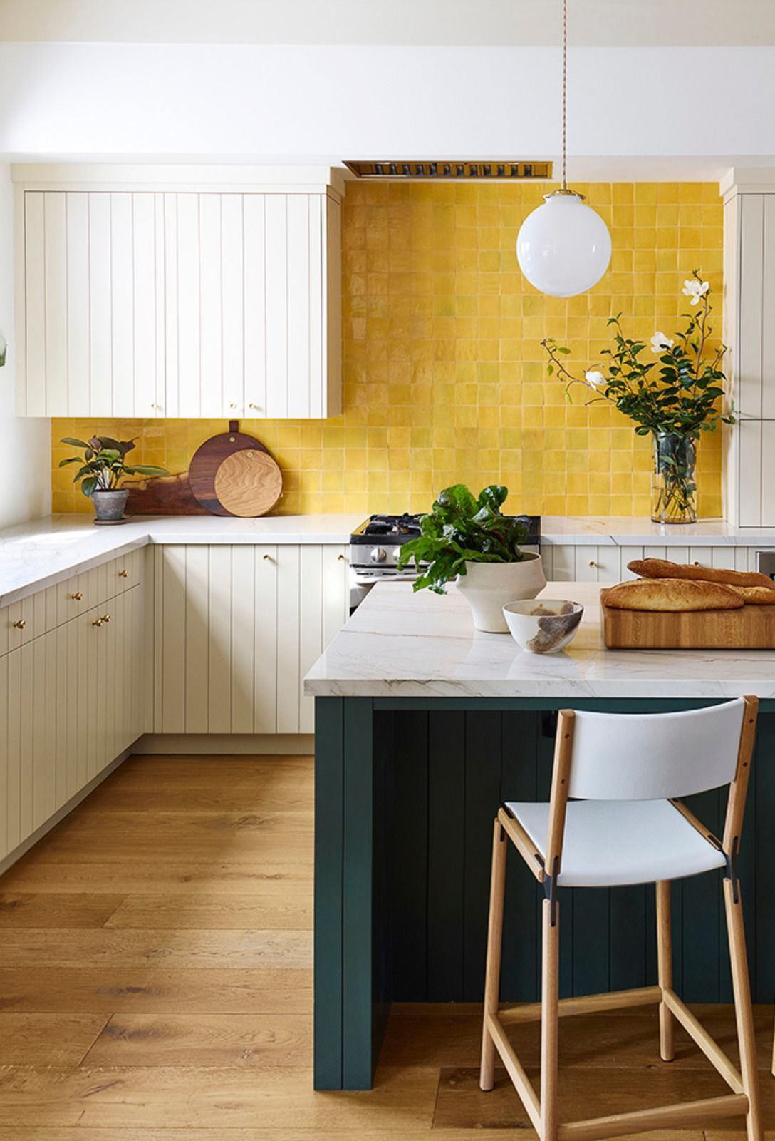
As the most attention-grabbing colour visible to our eyes, yellow is great to use when you want to stand out. In colour psychology, feelings of cheerfulness, warmth, hope and fun are commonly associated with yellow too. Those emotions are probably influenced by our connection to the sun, as we tend to represent it visually with yellow.
Yellow is quite a playful tone, and it can brighten up any areas of austerity in the kitchen. Whether as a feature wall or styling highlight, the many different tones of yellow can help reflect your mood. A darker hue like mustard is grounding and striking, while a light yellow is sweet and uplifting. Regardless of what shade you decide, yellow will never fail to bring a dash of optimism into your kitchen.
ABI products for a yellow kitchen colour scheme: Elysian Kitchen Mixer in Solis and the brushed brass range.
GREEN
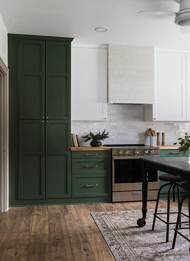
Green reminds us of the natural world, and we feel comforted by its refreshing qualities. Green colour psychology is primarily based on this understanding and reflects safety, renewal, growth and peace. From a scientific standpoint, low wavelength colours such as green have been found to improve focus, which is excellent for practical areas like the kitchen. Green can also be interpreted as positive and energising, as green in a set of traffic lights permits us to move forward and go.
For a calming, natural ambience, green is the ideal colour for kitchens. A backsplash could work as a nice feature, but also sage coloured cabinets are emerging as a popular choice. If you weren’t looking to permanently implement green, displaying plants in the area helps achieve that same peaceful quality.
BLUE
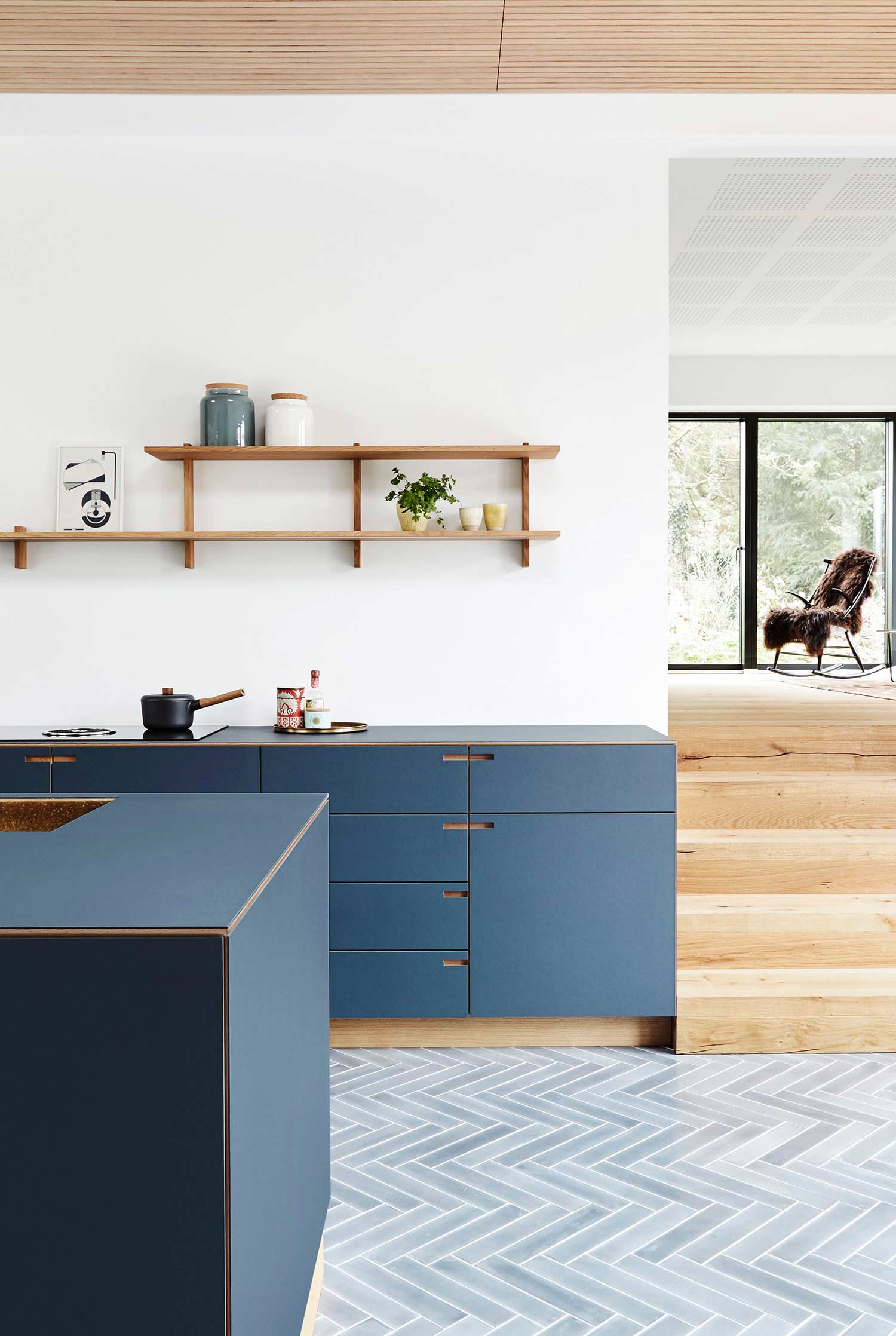
When we immerse ourselves in the ocean, our bodies tend to feel tranquil and restored. Apart from the physical side of that, the visual sea of blue plays a part in colour psychology. The University of Surrey did a study where participants were exposed to blue light, and it showed that their blood pressure dropped in similar levels to blood pressure-lowering medicines. While it can make us feel calm, it can also boost productivity levels compared to red or white rooms.
For many homes, the kitchen sets the tone for communal areas. So if you would like to come home to a relaxing and productive kitchen, choosing a blue colour scheme would help you achieve that. Blue is also a nice pairing in coastal homes, reflecting the soothing lull of the ocean.
ABI products for a blue kitchen colour scheme: Elysian Kitchen Mixer in Dusk.
BLACK
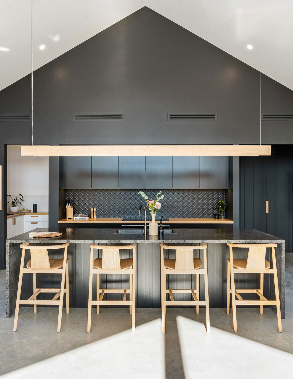
Mysterious, sophisticated and alluring, black is a famous tone for fashion and homes. Its high versatility is renowned worldwide, but could our collective adoration for it have an underlying psychological reason? In colour psychology, we associate black with strength and power. In Fengshui, the colour black is associated with water and represents calmness, creativity, depth and perseverance.
Try using it on cabinet doors or benchtops for a dramatic effect. If that’s too striking for your personal preferences, black is a beautiful colour on cabinetry pulls, tapware, and utensils.
ABI products for black kitchen colours: matte black tapware range.
GREY
Sitting between black and white is grey, an impartial and soft tone. As far as colour psychology goes, its neutrality means that it doesn’t have too much internal effect. With that said, certain grey tones can feel sombre, while others can feel sophisticated. Its diplomacy creates a stable environment, allowing you to experiment with other colours.
Grey could be an ideal kitchen colour scheme if you’re flipping houses, as it’s a widely accepted interior tone that would appeal to many. Apart from grey paint, concrete is a grey tone that can establish a grounding industrial feel in the kitchen. Try installing nickel or gunmetal fixtures and fittings if you would like to express grey colours.
ABI products for a grey kitchen colour scheme: brushed gunmetal range and brushed nickel range.
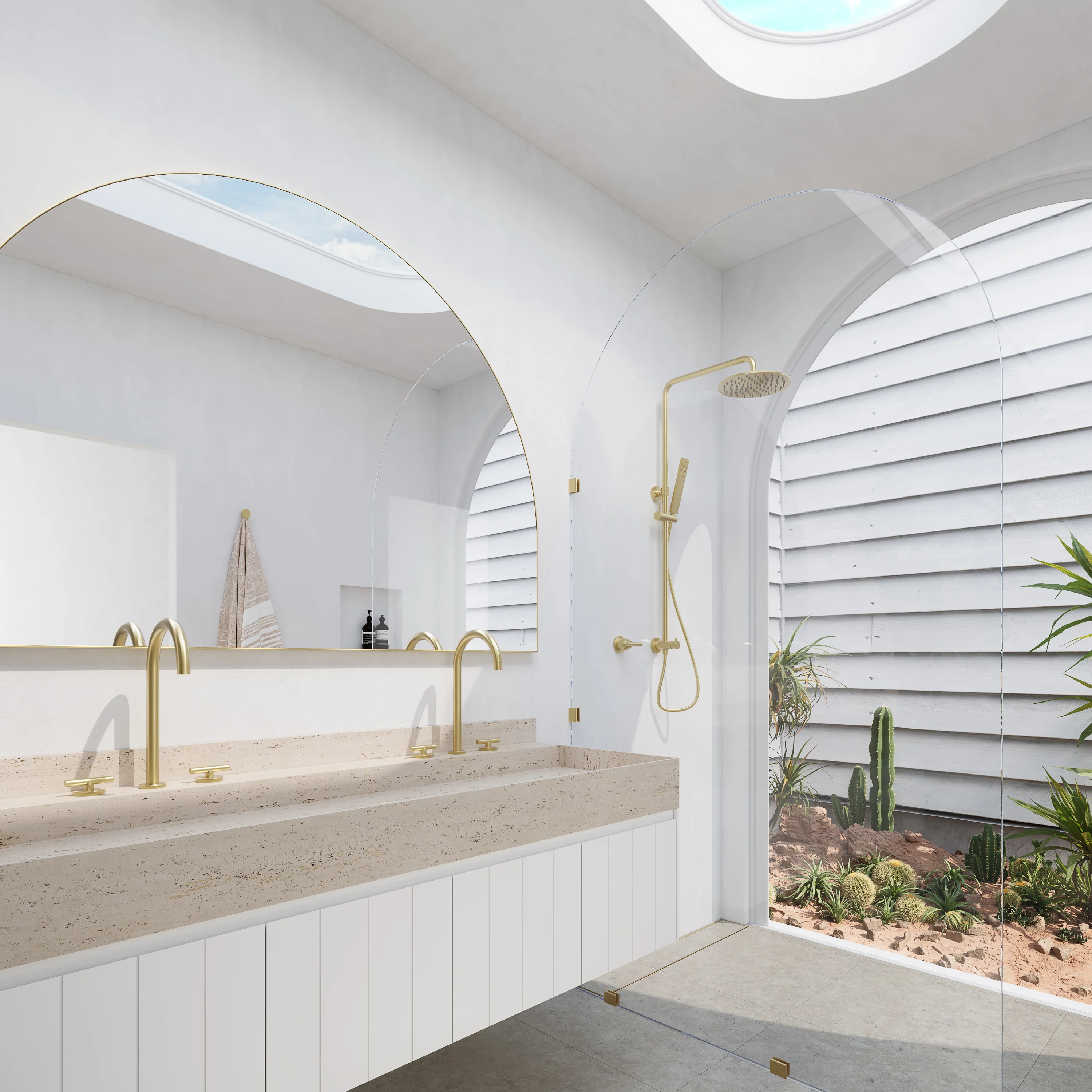
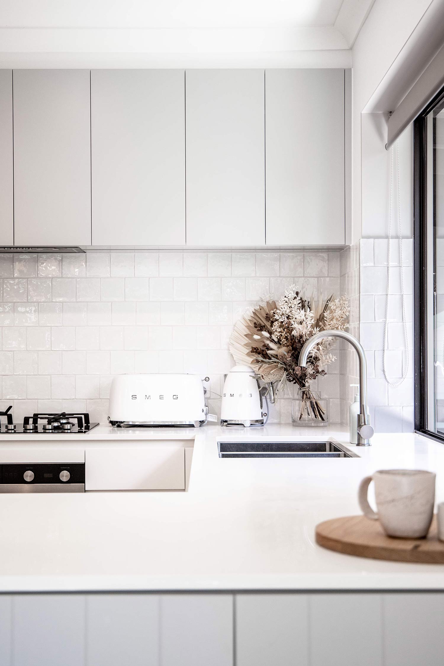
WHITE

White in colour psychology can represent innocence, purity, creativity and cleanliness. It embodies the concepts of new beginnings and refreshment, as white is the original blank canvas. Interestingly, white has opposing ideals depending on where you are in the world. In Western countries, white is commonly used to convey life’s celebrations like weddings, while in some Eastern countries, it can be linked to death and grief. Though, it’s a popular tone in homes, as white reflects all wavelengths of light, allowing a space to feel bright and illuminated.
White can be used in a multitude of ways in the kitchen. Even an all-white scheme doesn’t look overwhelming or dull. If you have lots of windows, a predominantly white kitchen can feel brighter with the abundance of natural light while allowing the outdoors to be an interesting feature piece. White fixtures and fittings bring an architectural element into space, as their designs can feel contemporary in a light tone.